This is an abridged form of an that essay first appeared as Issue 3 / Letters of Connaught Place of my newsletter I Spy with my Typographic Eye. Read the original, which includes a list of Instagram accounts that focus on capturing street lettering from Southeast Asia, and subscribe to the newsletter.
For some years now, I have tried and failed to devise a type walk in and around Connaught Place. It not a lack of interesting signs, but largely a challenge of space and time. The signs I would like to talk about are simply too scattered in the neighbourhood, and some, well, don’t even exist anymore. And so, until I find a way to time travel (maybe some new experiments with augmented reality?), or identify more signs within a smaller area to make this a viable idea, I am at an impasse. Or I was. Because hey, why not a photo essay for this newsletter instead.
If you’d like to use this essay to map a type walk of your own, I share below the route I would take if I were you. You’ll cover upwards of five kilometres, and early mornings are a great time to catch the market without its characteristic crowds, and in tolerable weather.
To Connaught Place!
For the uninitiated, Connaught Place is a commercial and shopping centre in Delhi, that was built as part of the imperial capital of New Delhi by the British. Space for Connaught Place was earmarked in 1913, a couple of years after George V announced the transfer of the country’s capital from Calcutta to Delhi, and its preliminary designs were drawn up by W.H. Nicholls, with additions by his successor, Robert Tor Russell. It continues to be a bustling marketplace today. I find the juxtaposition of the new and old, and how the place was used first by the British and then the Indian state, very fascinating, and reflected in the letters one sees there. I won’t go into the story of how Connaught Place came to be, and go straight into painting a typographic picture of the neighbourhood, but if you’re interested, Swapna Liddle’s Connaught Place and the Making of New Delhi is a great introduction to the subject.
The Eastern and Western Courts
The Eastern and Western Courts
For as long as I remember, I’ve been intrigued by the twin façades of The Eastern and Western Courts (location), which flank Janpath a little before the art deco hotel, The Imperial, as one approaches Connaught Place. Designed by Russell and built in the 1920s, both were intended to serve as hostels for visiting legislators when assemblies were in session, though The Eastern Court was sold to the Post and Telegraph Department soon after. Today it houses the offices of Mahanagar Telephone Nigam Limited (MTNL). The buildings’ signs, which I want to show you, aren’t always the easiest to see because they play hide-and-seek with the person on the street due to the dense tree cover in front of them.
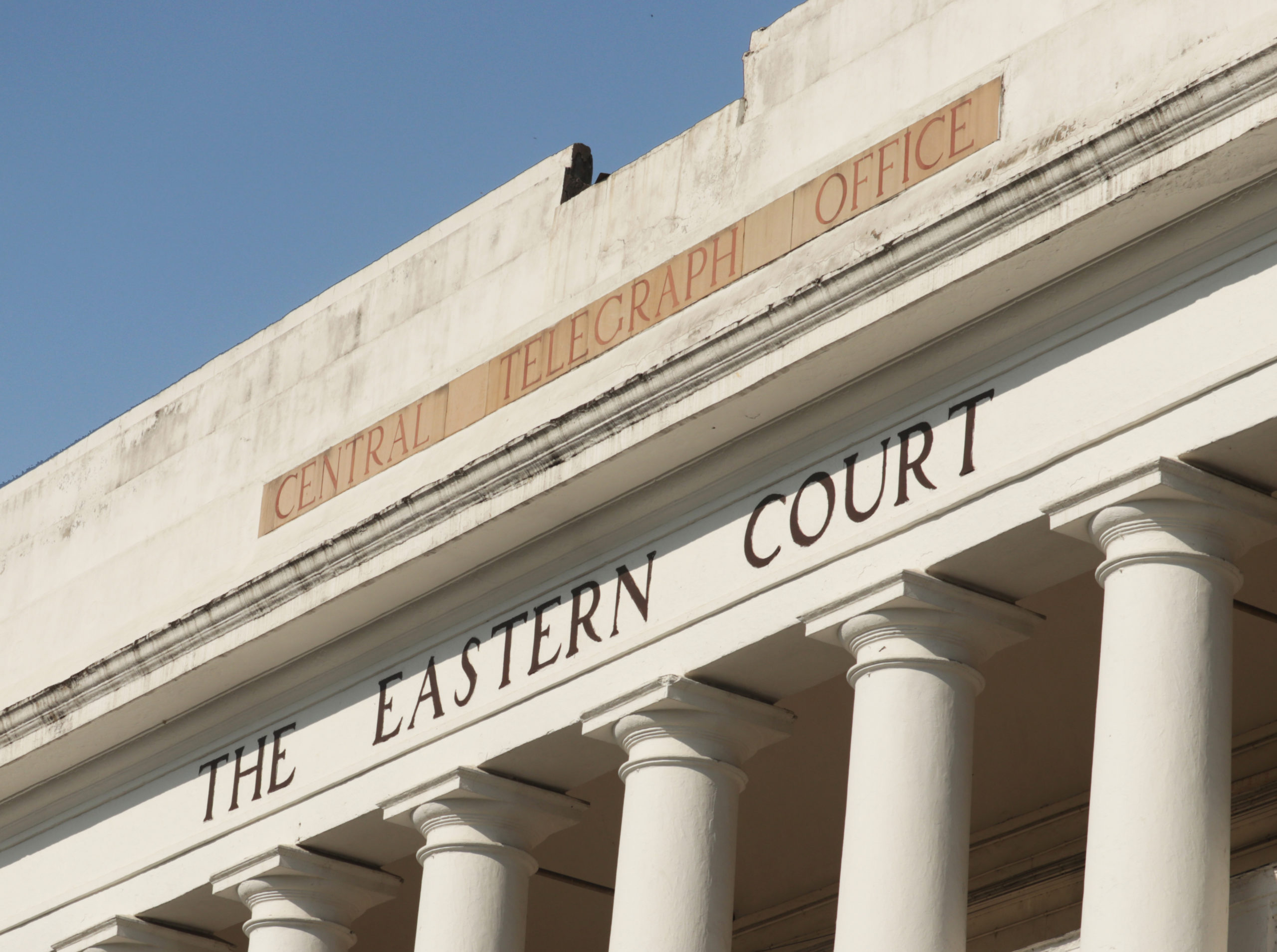
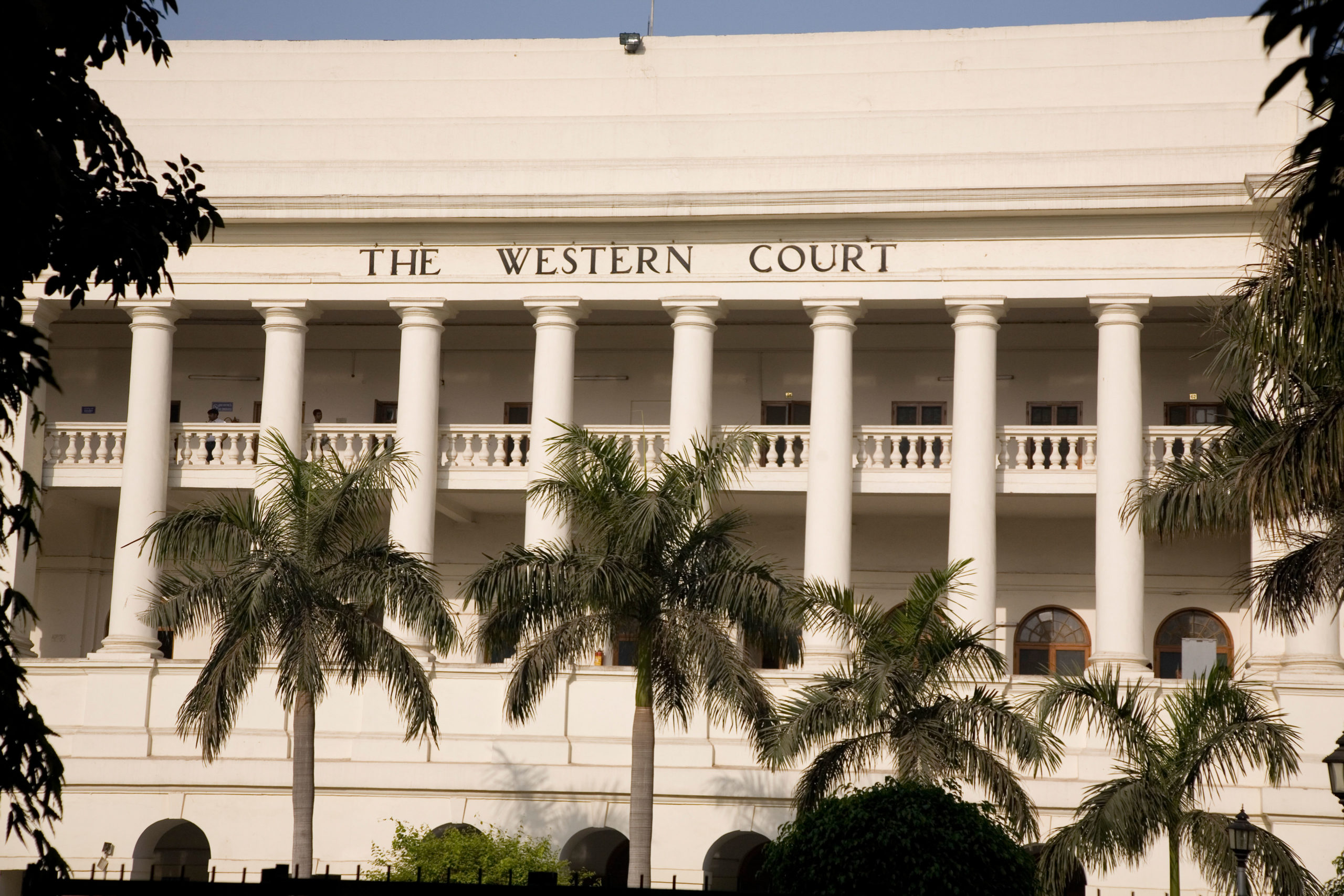
I visited this summer, and on the encouragement of a couple of MTNL staff I met outside, I ventured inside the gates of The Eastern Court, and took these pictures. No such luck at The Western Court, and so here is an image of the building and sign from 2008, by photographer Stuart Forster.
More so than any other sign in the very immediate neighbourhood, these letters are an imprint of British colonial rule in India, and the image that the British must have hoped to exude in their newly-built imperial capital. The letters are classical in style, like the buildings’ architecture, and no doubt intended to convey majesty and stateliness. To me, they look dwarfed due to their scale and placement, especially in photographs, and any affect they may have is diminished as a result. Call it my keen eye, or my ambivalence towards imposing colonial structures, but features like the the emaciated leg of the R, or the unseemly letter spacing around the T, make the overall appearance somewhat naïve.
The building, which was completed in January 1933, was designed by C.G. and F.B. Blomfield, and its construction supervised by Sobha Singh.
On this trip, I was happy to get a good look at the Central Telegraph Office sign too. This is likely not the original sign, since this photograph of the building from 1947 shows an altogether different one, and at a different location. I had never paid that much attention to it because until now, I hadn’t ever managed to see it properly. Its stubby, bracketed serifs, chopped-off spur of the G and extra wide word spaces (like the building signs) are worthy of their own close-up.
Modern High School
Still in the periphery of Connaught Place proper, now move two radials east to Barakhamba Road to yet another pre-Independence building, that of the Modern High School (location). It stands on land that was originally set aside for relocating Delhi University to (a plan shelved due to expense), and which was allotted to the school in 1930, a decade after it was founded in nearby Daryaganj.
The building, which was completed in January 1933, was designed by C.G. and F.B. Blomfield, and its construction supervised by Sobha Singh.
Pooja Saxena
—
The sign is installed at ground level. Its elegant uppercase letterforms have high contrast, sharp serifs, and despite wear and tear and the damage to the D, still look commanding. In the school emblem, the name is set in something that looks very much like Gill Sans (released by Monotype in 1928); and the motto, in Devanagari, has a broken headline, a style that I’m quite partial towards. Don’t miss the ल — which is in the regional form that is usually associated with the “Bombay style”, and today, with a Marathi preference.
- One
- Two
- Three
- One
- Two
- Three
| Heading | Column 1 | Column 2 |
| Row 1 | Lorem ipsum | Lorem ipsum |
| Row 2 | Lorem ipsum | Lorem ipsum |
| Row 3 | Lorem ipsum | Lorem ipsum |
| Row 4 | Lorem ipsum | Lorem ipsum |
Give special visual emphasis to a quote from your text.
Tejas